Build High-Converting Landing Pages for 2026
Small Business, Landing Pages, Conversion Optimization
How to Build a High-Converting Landing Page for Your Small Business in 2026
In 2026, a landing page is no longer just a digital brochure. It’s a focused, AI‑enhanced sales tool that can turn casual visitors into paying customers— if you build it with a clear goal, smart design, and the right expertise.
Start With One Specific Goal (and Match the Campaign)
A high-converting landing page is built around a single, specific goal: booking a consultation, downloading a guide, starting a free trial, or requesting a quote. When you try to sell everything at once, you dilute your message and confuse visitors. Every headline, image, and button should support that one outcome.
Equally important is matching the campaign that brings people to the page. If your ad promises “Free 15‑Minute Marketing Audit,” your landing page should repeat that exact phrase, use similar visuals, and make the audit the star of the page. This “message match” reassures visitors they’re in the right place and dramatically reduces drop‑offs (The Future of Landing Pages: Trends for 2026).
Guide Visitors Toward One Clear Action
Think of your landing page as a guided tour. From top to bottom, it should gently lead people toward one clear action: click a button, fill out a form, or schedule a call. In 2026, minimal navigation, clean layouts, and strategic micro‑interactions (like subtle button animations) help keep attention on that path instead of sending visitors wandering around your site.
Craft the Story: Problem, Solution, Benefits, and Process
1. Lead With a Strong, Benefit‑Driven Headline
Your headline is the first—and sometimes only—thing visitors read. Make it clear, specific, and benefit‑focused. Instead of “Accounting Services,” try “Cut Your Bookkeeping Time in Half in the Next 30 Days.” Research on 2026 landing page trends still points to concise, scannable copy as a top performer (Future of Landing Pages 2026).
2. Explain the Problem Clearly
Show visitors you understand what they’re struggling with. Use a short paragraph or bullet list to describe the problem in their words: missed calls, wasted ad spend, slow delivery times, confusing software—whatever fits your audience. When people feel understood, they’re more open to your solution.
3. Present Your Solution and Its Benefits
Next, introduce your offer as the clear solution. Focus less on features and more on benefits: “Get projects done 30% faster,” “Never miss another lead,” “Know exactly where your marketing budget goes.” Short bullet points and subheadings work well here so visitors can skim quickly on both desktop and mobile.
4. Explain the Process Step by Step
A simple process explanation removes friction. Use a “How it works” section—ideally 3–4 steps—to show what happens after someone clicks your CTA:
Step 1: Fill out a 30‑second form
Step 2: Get a confirmation email instantly
Step 3: Meet with our team at your chosen time
Clarity reduces anxiety—and higher confidence leads to higher conversion rates.
Build Trust: Social Proof and Visual Focus
In 2026, visitors expect real social proof. Include star ratings, short testimonials, logos of clients, or review snippets. Verified reviews and trust badges remain powerful trust signals (Landing Page Trends 2026).
Support your copy with a strong visual focus. Use a clean, minimalist design, plenty of white space, and relevant images that show your product, your team, or your customers using your service. Avoid generic stock photos; choose visuals that reinforce your message and direct attention toward your call to action.
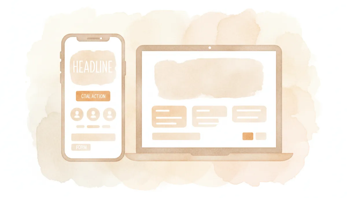
Clear messaging, focused visuals, and trust signals work together to lift conversions.
Make Action Easy: Clear CTA and Simple Forms
Your call to action (CTA) should be impossible to miss and effortless to understand. Use action verbs and clear outcomes: “Book Your Free Call,” “Get My Quote,” “Start My 7‑Day Trial.” Place your primary CTA above the fold and repeat it lower on the page for visitors who need more information before acting.
Pair your CTA with simple forms. Ask only for essential information—often just name, email, and one qualifying question. Long forms kill conversions, especially on mobile. You can always collect more details later once trust has been established.
Design for Mobile‑First Visitors in 2026
Most small‑business traffic now arrives via smartphones, and that trend will only grow (Mobile Optimization 2026). A high‑converting page must be mobile‑friendly:
Fast‑loading, responsive layout (consider AMP or similar technologies)
Large, thumb‑friendly buttons and tap targets
Forms optimized for small screens and autofill
Don’t forget accessibility: readable fonts, good color contrast, and clear labels make your page usable for more people and can improve overall performance (Web Design Trends).
How AI Helps You Optimize Landing Pages in 2026
AI has moved from “nice to have” to core landing page engine. Modern tools can:
Personalize content blocks for each visitor based on behavior and location (Forbes: Future of AI in Marketing)
Automate A/B testing of headlines, layouts, and CTAs, then push winning versions live without manual work
Use predictive analytics to flag which visitors are most likely to convert and adjust offers in real time
Generate copy variations and layout suggestions based on what’s already working for your audience
For small businesses, this means your landing page can keep improving automatically—24/7—rather than relying on occasional manual tweaks (MarketingDive: AI in Landing Page Optimization).
Why Professional Design, Development, and Marketing Still Matter
AI tools are powerful, but they don’t replace human judgment. A high‑converting landing page still benefits from professional expertise:
Designers create a visual hierarchy that guides the eye naturally to your CTA and ensures your brand looks trustworthy and consistent.
Developers handle performance, responsiveness, accessibility, and integrations with your CRM, booking tools, and email platforms.
Marketers align the page with your campaigns, craft persuasive messaging, and interpret analytics to make smart strategic decisions.
The best results in 2026 come from a blend of AI automation and human strategy—not from templates alone.
Simple Checklist for Launching a Successful Landing Page
Define one clear goal and matching offer for the page.
Align headline, copy, and visuals with your ad or email campaign.
Write a strong headline, problem statement, solution, and benefit bullets.
Add social proof: testimonials, ratings, or client logos.
Use one primary, clearly labeled CTA button (repeated as needed).
Keep forms short and easy, especially on mobile devices.
Choose relevant, professional images that support your message and brand.
Test load speed, mobile responsiveness, and accessibility basics.
Connect analytics and AI optimization tools; set up at least one A/B test.
Common Landing Page Mistakes to Avoid
Too many goals: multiple CTAs (e.g., “Call us,” “Download,” “Shop now”) competing for attention.
Weak or vague headlines: clever but unclear messaging that doesn’t say what you actually do.
Long, cluttered forms: asking for unnecessary details too early in the relationship.
Slow, non‑mobile‑friendly pages: heavy images, poor layout, and tiny buttons that frustrate mobile users (Fast Load Times for Landing Pages).
No social proof: expecting visitors to trust you without reviews, case studies, or guarantees.
“Set and forget” mindset: launching once and never using analytics or AI tools to optimize performance.
When you align a specific goal with a matching campaign, guide visitors toward a clear action, and combine smart AI tools with professional expertise, your landing page can become one of the most powerful growth engines for your small business in 2026 and beyond.